John Hussman has an interesting piece on predicting long-term market returns:
http://hussmanfunds.com/wmc/wmc050222.htm
The article is a bit dated (2005), but still fascinating.
In the short piece Hussman suggests that the projected annual total return on the S&P 500 over T years can be represented with the following equation:
- Long term total return = (1+g)(future PE / current PE)^(1/T) – 1 + dividend yield(current PE / future PE + 1) / 2
He makes the following assumptions and plugs them into the equation above: Peak to Peak earnings growth, g=6% T=10 years, future PE (E=Peak Earnings over cycle) range between 20 (major bull) and 7 (major bear)
He also presents the following graph after plugging the numbers into his model:

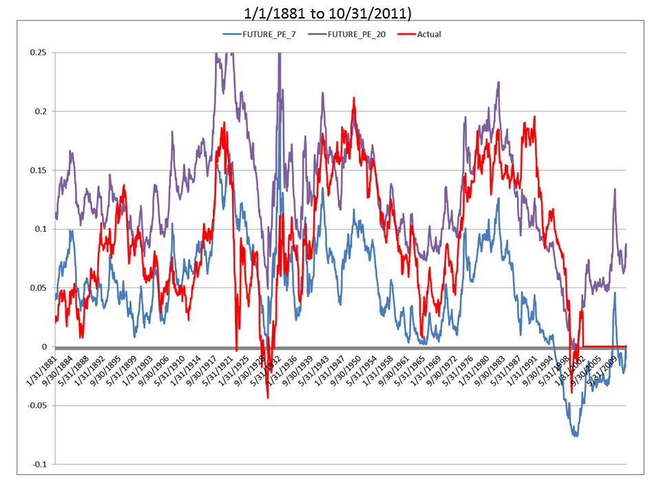
The blue line represents actual 10-year total returns on the S&P 500, and the other lines represent 10-year historical returns under various future P/E assumptions.
This is a pretty graph to observe. Hussman points out is that the future P/E range bands do a good job capturing where 10-year returns will likely fall. After staring at the chart for a good 20 minutes I decided to just recreate the chart and dig a little deeper.
I grabbed some data off of Shiller’s website and started going to town.
I first attempted to recreate Hussman’s chart, but with one slight change: Instead of using P/Peak Earnings ratios, I used Price / 10-year average earnings. As you will see, this small change in methodology has very little effect on the outcome. (FYI, I could have done it with Peak earnings ala Hussman, but had 10-year average earnings available.)
First, let’s check out the ENTIRE time series:
The simple 10-year total return prediction model does a pretty good job of isolating projected returns within an upper and lower bound. Of course, the Great Depression and the Internet Bubble threw the results for a loop (future P/E were outside the range of 7 and 20), but in general, Hussman’s model does a great job putting us in the “ballpark.”
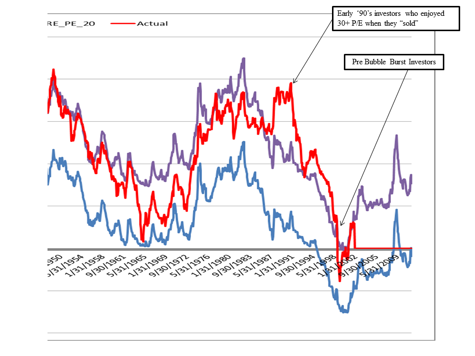
And how do our results compare to Hussman over 1950–> period?
Well, our graphs pretty much overlap, however, his data for actual 10-year returns ends in ~1995 since he created this chart in ~2005. We have the luxury of 5+ years of extra time to assess how the model performs. As predicted by the model, long-term returns SUCKED from ’95 onward.
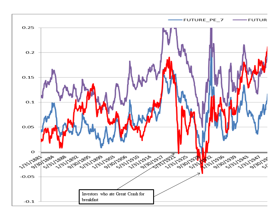
What about another “out-of-sample” test: the period before Hussman’s analysis (<1950).
It looks like the 10-year projection model does a decent job ‘bounding’ actual 10-year returns. Of course, investors involved in the market at the height of the 1929 bubble ate crow above and beyond the lower bound (the future P/E ended up below 7!). Overall though, Hussman’s return model does a decent job of showing us what is possible in the future over long time periods.
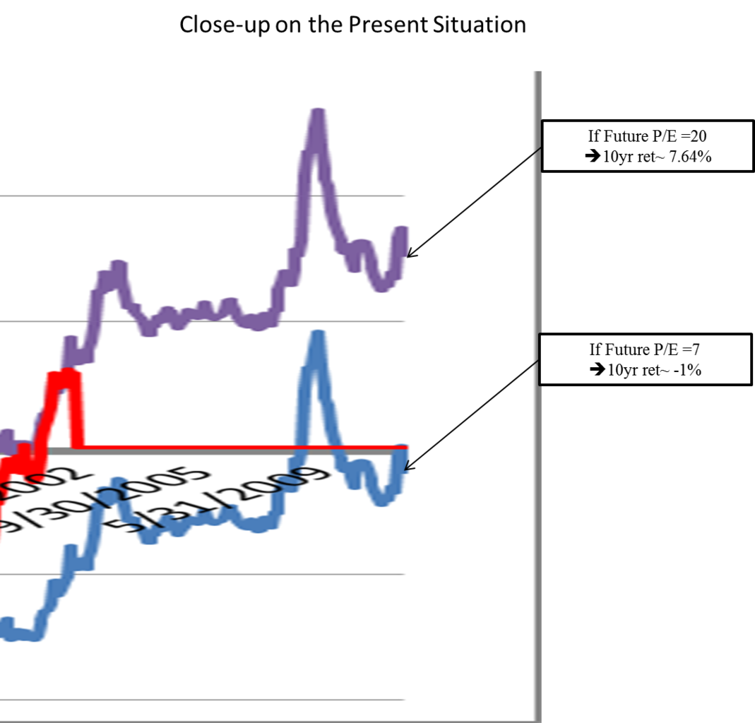
But who cares about the past, what about the future? Well, it isn’t pretty (as of October 31, 2010)…
Best case scenario–we sell out in 10 years when market Shiller P/E =20, which implies a 7.64% annual return
Worst case scenario–we sell out in 10 years when market Shiller P/E =7, implies a -1% annual return
Conclusion:
Given the long-term macroeconomic backdrop we currently face–anti-capitalism, high debt, high taxes, high volatility, limited confidence, potential inflation, peak profit margins, angry middle-class mobs who are getting beatdown by the competition in India/China–I’d guess the Shiller P/E will likely be closer to 7 than to 20 in 10 years time.
Then again, WHO REALLY KNOWS?
Answer: NOBODY.
BTW. We are going to work on incorporating the “Hussman” model into our Turnkey Analyst platform very soon. Stay tuned.

About the Author: Wesley Gray, PhD
—
Important Disclosures
For informational and educational purposes only and should not be construed as specific investment, accounting, legal, or tax advice. Certain information is deemed to be reliable, but its accuracy and completeness cannot be guaranteed. Third party information may become outdated or otherwise superseded without notice. Neither the Securities and Exchange Commission (SEC) nor any other federal or state agency has approved, determined the accuracy, or confirmed the adequacy of this article.
The views and opinions expressed herein are those of the author and do not necessarily reflect the views of Alpha Architect, its affiliates or its employees. Our full disclosures are available here. Definitions of common statistics used in our analysis are available here (towards the bottom).
Join thousands of other readers and subscribe to our blog.