Welcome to a year-end installment of Reproducible Finance with R, a series posts that will be a little bit different from the norm on Alpha Architect (see here for my last post). We will search for and hopefully unearth some interesting market conditions, but we’ll primarily focus on the code that we use for telling stories with data.
Today’s project is to visualize market sector trends/breadth as reflected by moving averages. Specifically, we will calculate and chart the percentage of stocks within each industry sector whose 50-day rolling average price (SMA 50) currently exceeds it’s 200-day rolling average price (SMA 200). We won’t make this calculation for every stock, instead we’ll use the top 1500 holdings of Vanguard’s total market ETF, VTI — a good approximation.
We will ultimately build three data assets.
Current Sector Trends
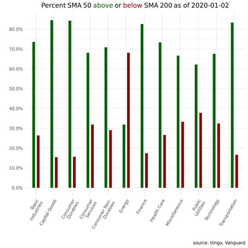
First, a snapshot of sector trends as of today. The green bars reflect the percentage of firms in a given industry where the 50-day is above the 200-day moving average; red represents the percentage of firms in an industry where the 50-day is below the 200-day moving average.
Second, an animation that loops through the last two years and lets us see how things change from month to month.
And third an animation showing which sector had the most tickers in a positive trend in a given month.
These examples deal with only the last couple of years of data but the code we’ll review can be easily extended other years and custom metrics beyond SMAs.
Let’s get to it!
Digging in to the Code
First, let’s load up the R packages we’ll need for today’s work.
library(tidyquant)
library(tidyverse)
library(ggtext)
library(plotly)
library(riingo)
library(roll)
We can grab fund holdings data from Vangaurd’s website here and import a CSV of the fund’s full holdings.
Vanguard doesn’t make it easy to programmatically import that data but I saved the data as a CSV and plunked it into a server. We can pass the link directly to the read_csv() function.
vti_total_mkt_holdings <-
  read_csv("https://colorado.rstudio.com/rsc/vti-holdings/data.csv",
           col_types = cols(COUNTRY = col_skip(),
                            `SECURITY DEPOSITORY RECEIPT TYPE` = col_skip(),
                            SEDOL = col_skip(), X1 = col_skip())) %>%
  janitor::clean_names()


vti_total_mkt_holdings %>%
  head()
  holdings     ticker percent_of_funds sector          market_value  shares
1 Microsoft C… MSFT   3.69%            Systems Softwa… $32,488,013,… 2.15e8
2 Apple Inc.   AAPL   3.47%            Technology Har… $30,551,146,… 1.14e8
3 Amazon.com … AMZN   2.42%            Internet & Dir… $21,282,549,… 1.18e7
4 Facebook In… FB     1.55%            Interactive Me… $13,632,979,… 6.76e7
5 Berkshire H… BRK.B  1.34%            Multi-Sector H… $11,771,129,… 5.34e7
6 JPMorgan Ch… JPM    1.26%            Diversified Ba… $11,109,289,… 8.43e7
We have 3,559 tickers and our analysis will go back about 3 years. For today, let’s import the price history of only the first 1500 tickers (the 1500 with the highest weight in the fund) from the excellent data source tiingo. There’s an R package called riingo that makes it easy to access the tiingo API via a function called riingo_prices(). We’ll supply the first 1500 tickers to that function, an end date of today and a start today of three years ago.
If you’re following along at home, note that importing 3 years of daily prices for 1500 tickers will take a bit of time and compute. Coder beware.
# Set start and end dates for the price import
end <- today() %>% ymd()
start <- end - years(3)

# pull tickers and pass to riingo_prices()
vti_prices_1_1500 <-
  vti_total_mkt_holdings %>%
  # BRK's ticker is in the wrong format. We can manipulate the string before passing to tiingo.
  mutate(ticker = str_replace(ticker, "BRK.B", "BRK-B")) %>%
  slice(1:1500) %>%
  pull(ticker) %>%
  riingo_prices(start_date = start, end_date = end)
Here are the first few lines of our new price object.
vti_prices_1_1500 %>%
  head()
  ticker date                close  high   low  open volume adjClose
1 MSFT   2016-12-30 00:00:00  62.1  63.0  62.0  63.0 2.56e7     58.9
2 MSFT   2017-01-03 00:00:00  62.6  62.8  62.1  62.8 2.07e7     59.3
3 MSFT   2017-01-04 00:00:00  62.3  62.8  62.1  62.5 2.13e7     59.0
4 MSFT   2017-01-05 00:00:00  62.3  62.7  62.0  62.2 2.49e7     59.0
5 MSFT   2017-01-06 00:00:00  62.8  63.2  62.0  62.3 1.99e7     59.5
6 MSFT   2017-01-09 00:00:00  62.6  63.1  62.5  62.8 2.04e7     59.4
We have 1500 tickers, with about 700 observations each of daily OHLC and volume, giving us an object with ~1,098,000 rows.
Since we’ll be doing sector analysis, we need to add the sector labels to this object. We could pull those from the original Vanguard CSV file but I find their sector labels to be a bit esoteric, or at least different what I have seen as the standard. VG has 161 sectors, and here’s 20 of them:
vti_total_mkt_holdings %>%
  select(sector) %>%
  distinct() %>%
  slice(1:20)
sector 1 Systems Software 2 Technology Hardware, Storage & Periphera 3 Internet & Direct Marketing Retail 4 Interactive Media & Services 5 Multi-Sector Holdings 6 Diversified Banks 7 Pharmaceuticals 8 Data Processing & Outsourced Services 9 Household Products 10 Integrated Oil & Gas 11 Movies & Entertainment 12 Integrated Telecommunication Services 13 Managed Health Care 14 Semiconductors 15 Home Improvement Retail 16 Soft Drinks 17 Cable & Satellite 18 Aerospace & Defense 19 Communications Equipment 20 Hypermarkets & Super Centers
Instead of using those labels, let’s go with the more traditional sector labels used by most exchanges.
I have a CSV that stores those sector labels and maps them to around 6000 thousand tickers.
exchange_tickers_sectors <- read_csv("https://colorado.rstudio.com/rsc/sector-labels/data.csv")
exchange_tickers_sectors %>%
  head()
We can use left_join() to add those sector labels to our price object and then take a peek at a few well-known tickers.
vti_prices_1_1500 %>%
  select(ticker, date, close) %>%
  left_join(exchange_tickers_sectors %>% select(ticker, sector)) %>%
  select(date, ticker, sector, close) %>%
  group_by(ticker) %>%
  filter(ticker %in% c("MSFT", "GS", "PFE", "AMZN", "CVX")) %>%
  slice(1)
Now let’s calculate the rolling 50-day and 200-day averages using the roll_mean() function from the roll package. Since we ultimately want so sum how many tickers within each sector are in a certain trend, let’s add a column called sma_50_greater_than_sma_200 that’s equal to 1 if the 50-day SMA exceeds the 200-day SMA and 0 otherwise. This same code flow could be used to calculate other rolling averages and add appropriate flags. An automated trading system would start from a similar scaffolding, except we would code up further if...else logic to execute a trade under certain conditions instead of just notating 1’s and 0’s.
Back to the task at the hand, here’s the code flow to calculate SMA 50 and SMA 200 and flag the trend appropriately.
vti_prices_1_1500 %>%
  select(ticker, date, close) %>%
  left_join(exchange_tickers_sectors %>% select(ticker, sector)) %>%
  group_by(ticker) %>%
  mutate(sma_50 = roll_mean(as.matrix(close), 50, complete_obs = T),
         sma_200 = roll_mean(as.matrix(close), 200, complete_obs = T),
         sma_50_greater_than_sma_200 = case_when(sma_50 > sma_200 ~ 1,
                                                 TRUE ~ 0)) %>%
  na.omit() %>%
  head()
  ticker date                close sector  sma_50 sma_200 sma_50_greater_t…
  <
1 MSFT   2017-10-16 00:00:00  77.6 Techno…   74.2    69.0                 1
2 MSFT   2017-10-17 00:00:00  77.6 Techno…   74.3    69.1                 1
3 MSFT   2017-10-18 00:00:00  77.6 Techno…   74.4    69.1                 1
4 MSFT   2017-10-19 00:00:00  77.9 Techno…   74.5    69.2                 1
5 MSFT   2017-10-20 00:00:00  78.8 Techno…   74.6    69.3                 1
6 MSFT   2017-10-23 00:00:00  78.8 Techno…   74.8    69.4                 1
Recall that our first goal is to build a snaphshot, as of today, which means we’ll filter this data down to it’s last date with filter(date == max(date)). We will then count() the number of 1’s in the sma_50_greater_than_sma_200 column.
vti_prices_1_1500 %>%
  select(ticker, date, close) %>%
  left_join(exchange_tickers_sectors %>% select(ticker, sector)) %>%
  group_by(ticker) %>%
  mutate(sma_50 = roll_mean(as.matrix(close), 50, complete_obs = T),
         sma_200 = roll_mean(as.matrix(close), 200, complete_obs = T),
         sma_50_greater_than_sma_200 = case_when(sma_50 > sma_200 ~ 1,
                                                 TRUE ~ 0)) %>%
  na.omit() %>%
  filter(date == max(date)) %>%
  group_by(sector) %>%
  count(sma_50_greater_than_sma_200)
   sector                sma_50_greater_than_sma_200     n
 1 Basic Industries                                0    23
 2 Basic Industries                                1    64
 3 Capital Goods                                   0    21
 4 Capital Goods                                   1   115
 5 Consumer Durables                               0     8
 6 Consumer Durables                               1    43
 7 Consumer Non-Durables                           0    23
 8 Consumer Non-Durables                           1    56
 9 Consumer Services                               0    96
10 Consumer Services                               1   205
# … with 14 more rows
In the resulting data frame, count() has created a column called n that is the sum of the tickers in each sector whose SMA 50 exceeds the SMA 200. We can express this n as a percent with percent = n/sum(n) and add better labels for when we eventually chart this data.
vti_prices_1_1500 %>%
  select(ticker, date, close) %>%
  left_join(exchange_tickers_sectors %>% select(ticker, sector)) %>%
  group_by(ticker) %>%
  mutate(sma_50 = roll_mean(as.matrix(close), 50, complete_obs = T),
         sma_200 = roll_mean(as.matrix(close), 200, complete_obs = T),
         sma_50_greater_than_sma_200 = case_when(sma_50 > sma_200 ~ 1,
                                                 TRUE ~ 0)) %>%
  na.omit() %>%
  filter(date == max(date)) %>%
  group_by(sector) %>%
  count(sma_50_greater_than_sma_200) %>%
  mutate(percent = n/sum(n),
         trend = case_when(sma_50_greater_than_sma_200 == 1 ~ "sma50 above sma200",
                           TRUE ~ "sma50 below sma200"),
         percent_label = scales::percent(percent)) %>%
  select(sector, trend, percent_label) %>%
  head()
  sector            trend              percent_label

1 Basic Industries  sma50 below sma200 26.4%
2 Basic Industries  sma50 above sma200 73.6%
3 Capital Goods     sma50 below sma200 15.4%
4 Capital Goods     sma50 above sma200 84.6%
5 Consumer Durables sma50 below sma200 15.7%
6 Consumer Durables sma50 above sma200 84.3%
We did quite a bit of tidying and transforming there – we’re down to 24 observations from 736,000 – let’s save the results in a new data object called vti_sma50_sma_200.
vti_sma50_sma_200_most_recent <-
vti_prices_1_1500 %>%
  select(ticker, date, close) %>%
  left_join(exchange_tickers_sectors %>% select(ticker, sector)) %>%
  group_by(ticker) %>%
  mutate(sma_50 = roll_mean(as.matrix(close), 50, complete_obs = T),
         sma_200 = roll_mean(as.matrix(close), 200, complete_obs = T),
         sma_50_greater_than_sma_200 = case_when(sma_50 > sma_200 ~ 1,
                                                 TRUE ~ 0)) %>%
  na.omit() %>%
  filter(date == max(date)) %>%
  group_by(sector) %>%
  count(sma_50_greater_than_sma_200) %>%
  mutate(percent = n/sum(n),
         trend = case_when(sma_50_greater_than_sma_200 == 1 ~ "sma50 above sma200",
                           TRUE ~ "sma50 below sma200"),
         percent_label = scales::percent(percent)) %>%
  group_by(trend) %>%
  # remove cash sector
  filter(!(str_detect(sector, 'cash|Cash'))) %>%
  # coerce sector labels to wrap text so they'll fit on our chart
  mutate(sector = str_wrap(sector, width = 13))
Now we can pipe that saved data object to ggplot and plotly and create a nice visualization of sector breadth as of January 2, 2020.
(
vti_sma50_sma_200_most_recent %>%
ggplot(aes(x = sector, y = percent, fill = trend, text = str_glue("{sector}: {percent_label}"))) +
geom_col(width = .3, position = position_dodge(width = .5), show.legend = F) +
scale_y_continuous(labels = scales::percent_format(),
breaks = scales::pretty_breaks(n = 10)) +
labs(x = "",
y = "",
title = paste("Percent SMA 50 <span style='color:darkgreen'>above</span> or <span style='color:darkred'>below</span> SMA 200 \n as of", today()),
caption = "source: tiingo, Vanguard") +
scale_fill_manual(values = c( "darkgreen", "darkred")) +
theme_minimal() +
theme(axis.text.x = element_text(angle = 60, hjust = 1),
plot.title = element_markdown(hjust = .5),
plot.subtitle = element_text(hjust = .5))
) %>%
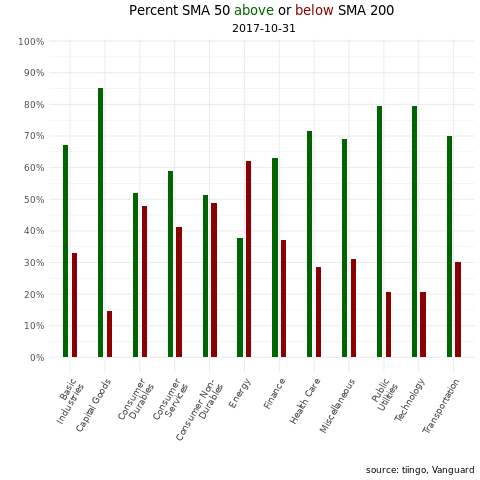
ggplotly(tooltip = "text") We have a snapshot as of today, but of course that doesn’t give us any idea of how sector breadth has changed or developed over the last few years. For that, we can turn to an animation via the gganimate() package. Let’s create a data frame that we can pass to the animation code flow. We have daily data but that will make for a quite a few transitions in an animation, one for each day. Let’s trim this data we so have one observation per month.
vti_sma50_sma_200_for_gif <-
vti_prices_1_1500 %>%
  select(ticker, date, close) %>%
  left_join(exchange_tickers_sectors %>% select(ticker,  sector)) %>%
  group_by(ticker) %>%
  mutate(sma_50 = roll_mean(as.matrix(close), 50, complete_obs = T),
         sma_200 = roll_mean(as.matrix(close), 200, complete_obs = T),
         sma_50_greater_than_sma_200 = case_when(sma_50 > sma_200 ~ 1,
                                                 TRUE ~ 0),
         current_greater_than_sma_50 = case_when(close > sma_50 ~ 1,
                                                 TRUE ~ 0)) %>%
  na.omit() %>%
  filter(date > "2017-10-16") %>%
  group_by(sector, date) %>%
  count(sma_50_greater_than_sma_200) %>%
  mutate(percent = n/sum(n),
         trend = case_when(sma_50_greater_than_sma_200 == 1 ~ "sma50 above sma200",
                           TRUE ~ "sma50 below sma200")) %>%
  group_by(trend) %>%
  filter(!(str_detect(sector, 'cash|Cash'))) %>%
  mutate(sector = str_wrap(sector, width = 13)) %>%
  group_by(strftime(date, "%Y-%m")) %>% #Groups by the yearmonths
  filter(date == max(date)) %>%
  ungroup()
Now we pass that data frame to the same ggplot() code as we did for the snapshot, except we use the transition_states() function to tell the plot to loop through different dates.
library(gganimate)
library(gifski)
library(png)

p <-
  vti_sma50_sma_200_for_gif %>%
  ggplot(aes(x = sector, y = percent, fill = trend)) +
  geom_col(width = .3, position = position_dodge(width = .5), show.legend = F) +
  scale_y_continuous(labels = scales::percent_format(), breaks = scales::pretty_breaks(n = 10)) +
  scale_fill_manual(values = c( "darkgreen", "darkred")) +
  theme_minimal() +
  labs(title = "Percent SMA 50 <span style='color:darkgreen'>above</span> or <span style='color:darkred'>below</span> SMA 200", subtitle = " {closest_state}", y= "", x = "", caption = "source: tiingo, Vanguard") +
  theme(axis.text.x = element_text(angle = 60, hjust = 1),
        plot.title = element_markdown(hjust = .5),
        plot.subtitle = element_text(hjust = .5)) +
  # this creates the loop through the dates, it's the workhorse
  transition_states(date,
                    transition_length = 5,
                    state_length = 5) +
  # some aesthetic bells and whistles to make stuff prettier
  ease_aes('cubic-in-out')  +
  enter_fade() +
  exit_shrink()

animate(p, fps = 5, renderer = gifski_renderer(loop = TRUE))
That animation gives us a nice way to skim through sector trend breadth over the last couple of years. Stare at it for a couple of seconds and it’s interesting to see how the latter part of 2018 was exhibiting widespread negative trend but 2019 has been consistently, widely strong across sectors, with the exception of the energy sector.
A natural follow up inquiry might be to examine breadth not based on whether a positive or a negative percentage sector tickers are in a trend, but instead to rank sectors according to which has the highest percentage of tickers in a positive trend. We can think of that as within sector trend strenght. For example, we might wonder whether in Jnauary of 2019, the financial sector had more tickers in positive trend that the energy sector.
vti_prices_1_1500 %>%
  select(ticker, date, close) %>%
  left_join(exchange_tickers_sectors %>% select(ticker, sector)) %>%
  group_by(ticker) %>%
  mutate(sma_50 = roll_mean(as.matrix(close), 50, complete_obs = T),
         sma_200 = roll_mean(as.matrix(close), 200, complete_obs = T),
         sma_50_greater_than_sma_200 = case_when(sma_50 > sma_200 ~ 1,
                                                 TRUE ~ 0)) %>%
  na.omit() %>%
  filter(date == max(date)) %>%
  group_by(sector) %>%
  count(sma_50_greater_than_sma_200) %>%
  mutate(percent = n/sum(n),
         trend = case_when(sma_50_greater_than_sma_200 == 1 ~ "sma50 above sma200",
                           TRUE ~ "sma50 below sma200"),
         percent_label = scales::percent(percent)) %>%
  group_by(trend) %>%
  # remove cash and misc sector
  filter(!(str_detect(sector, 'cash|Cash|Miscellaneous'))) %>%
  filter(sma_50_greater_than_sma_200 == 1 ) %>%
  mutate(ordering = rank(percent, ties.method = "random"),
         percent_label = scales::percent(round(percent, 2))) %>%
  ggplot(aes(ordering, group = sector, color = sector,fill = sector)) +
  geom_tile(aes(y = percent/2,
                height = percent ,
                width = .9), alpha = 0.9) +
  # text on top of bars
  geom_text(aes(y = percent, label =  sector ), hjust = -0.1) +
  geom_text(aes(y = percent, label =  percent_label ), color = "white", hjust = 1.2) +
  # text in x-axis (requires clip = "off" in coord_cartesian)
  coord_flip(clip = "off", expand = T)   +
  scale_y_continuous(labels=scales::percent) +
  expand_limits(y = c(.1, 1.2)) +
  scale_x_continuous(expand = c(0, 0)) + scale_y_continuous(expand = c(0, 0)) +
  guides(color=F,fill=F) +
  labs(x = "", y = "", title = "Percentage tickers sma 50 above sma 200",
       subtitle = paste("as of", today()),
       caption = "source: tiingo, Vanguard, author calcs") +
  theme_bw() +
  theme(axis.text.y = element_blank(),
        axis.ticks.y = element_blank(),
        axis.text.x = element_blank(),
        axis.ticks.x = element_blank(),
        plot.title = element_text(hjust = .5),
        plot.subtitle = element_text(hjust = .5),
        panel.grid.major = element_blank(),
        panel.grid.minor = element_blank(),
panel.background = element_blank())
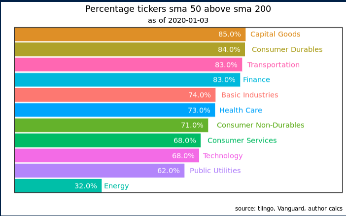
The results are hypothetical results and are NOT an indicator of future results and do NOT represent returns that any investor actually attained. Indexes are unmanaged and do not reflect management or trading fees, and one cannot invest directly in an index.
Same as before, we have a snapshot from a moment in time but we can add animation to see how things have changed over time.
rank_chart <-
vti_prices_1_1500 %>%
  select(ticker, date, close) %>%
  left_join(exchange_tickers_sectors %>% select(ticker, sector)) %>%
  group_by(ticker) %>%
  mutate(sma_50 = roll_mean(as.matrix(close), 50, complete_obs = T),
         sma_200 = roll_mean(as.matrix(close), 200, complete_obs = T),
         sma_50_greater_than_sma_200 = case_when(sma_50 > sma_200 ~ 1,
                                                 TRUE ~ 0)) %>%
  na.omit() %>%
  group_by(sector, date) %>%
  count(sma_50_greater_than_sma_200) %>%
  mutate(percent = n/sum(n),
         trend = case_when(sma_50_greater_than_sma_200 == 1 ~ "sma50 above sma200",
                           TRUE ~ "sma50 below sma200"),
         percent_label = scales::percent(percent)) %>%
  group_by(trend) %>%
  # remove cash sector
  filter(!(str_detect(sector, 'cash|Cash|Miscellaneous')) &
         sma_50_greater_than_sma_200 == 1 &
           date > "2017-10-04") %>%
  mutate(date = ymd(date)) %>%
  group_by(date) %>%
  mutate(ordering = rank(percent, ties.method = "random"),
         percent_label = scales::percent(round(percent, 2))) %>%
  group_by(strftime(date, "%Y-%m")) %>% #Groups by the yearmonths
  filter(date == max(date)) %>%
  ungroup() %>%
ggplot(aes(ordering, group = sector, color = sector,fill = sector)) +
  geom_tile(aes(y = percent/2,
                height = percent ,
                width = .9), alpha = 0.9) +
  # text on top of bars
  geom_text(aes(y = percent, label =  sector ), hjust = -0.1) +
   geom_text(aes(y = percent, label =  percent_label ), color = "white", hjust = 1.2) +
  # text in x-axis (requires clip = "off" in coord_cartesian)
  coord_flip(clip = "off", expand = T)   +
  scale_y_continuous(labels=scales::percent) +
  expand_limits(y = c(.1, 1.2)) +
  scale_x_continuous(expand = c(0, 0)) + scale_y_continuous(expand = c(0, 0)) +
  guides(color=F, fill=F) +
  theme_bw() +
  theme(axis.text.y = element_blank(),
        axis.ticks.y = element_blank(),
        axis.text.x = element_blank(),
        axis.ticks.x = element_blank(),
        plot.title = element_text(hjust = .5),
        plot.subtitle = element_text(hjust = .5),
        panel.grid.major = element_blank(),
        panel.grid.minor = element_blank(),
        panel.background = element_blank()) +
  transition_states(date) +
  ease_aes('cubic-in-out') +
  labs(x = "", y = "", title = "Percentage tickers sma 50 above sma 2000",
       subtitle = "as of {closest_state}",
       caption = "source: tiingo, Vanguard, author calcs"
       )

animate(rank_chart, fps = 4, renderer = gifski_renderer(loop = TRUE))
Conclusions
I didn’t expect to notice anything too different in this iteration of the chart but I was wrong. I hadn’t previously paid attention to the fact that the Public Utilities sector had the highest percentage of tickers in positive trend for a large part of 2019, and that made me realize that in the previous chart I had gleaned a good idea of overall breadth but I had not focused on the individual sectors. Public utilities hadn’t stood out at all, and even though the previous chart wasn’t supposed to highlight individual sectors, I was still surprised I’d completely missed this.
This ranked bar chart format and its ability to focus our attention on a sector according to its rank on some metric has a lot of potential for further portfolio analysis. Next time we can look at ranked contributions to ETF returns, to examine how the internals have changed over time.
If you’re interested in the code for a more standard look at sector performance, there’s a post from 2019 here. If you’re brand new to R and want to get into portfolio visualization, check out my book Reproducible Finance with R.
Thanks for reading!
About the Author: Jonathan Regenstein
—
Important Disclosures
For informational and educational purposes only and should not be construed as specific investment, accounting, legal, or tax advice. Certain information is deemed to be reliable, but its accuracy and completeness cannot be guaranteed. Third party information may become outdated or otherwise superseded without notice. Neither the Securities and Exchange Commission (SEC) nor any other federal or state agency has approved, determined the accuracy, or confirmed the adequacy of this article.
The views and opinions expressed herein are those of the author and do not necessarily reflect the views of Alpha Architect, its affiliates or its employees. Our full disclosures are available here. Definitions of common statistics used in our analysis are available here (towards the bottom).
Join thousands of other readers and subscribe to our blog.