In my past life as a rower, I spent a lot of time figuring out which way the wind was blowing: Would it be a headwind and slow things down? Or would it be a tailwind and shorten the race? But a tailwind that went against the current could cause choppy water…which would slow things back down. Variables affect other variables and things can get confusing, quickly.
Investing is no different.
A question we regularly get in the current environment is, “How does inflation affect value stocks?” Well…it depends. I could show you some data on how value stocks did in the 70’s (period of high inflation) versus how they did in the 90’s (low inflation). But if WW3 broke out tomorrow, wouldn’t that variable quickly top all other variables? Probably. So let’s table that variable.
The one variable that I think prevails over all others, from a relative performance standpoint for long-only value investors, is the spread between value and growth stocks(1). I wrote about that in my last post in November. Why? Because there are always going to be shocks to the market. There are going to be inflation spikes, wars, deflation, pandemics, recessions, etc. The often-used Benjamin Graham quote, “Over the short run the market is a voting machine, over the long run it’s a weighing machine,” rings as true as ever as we watch the stretched “stay at home” (such as Zoom) stocks fall. The spread between value and growth stocks tells us how far that weighing machine has been stretched by short-term votes and may indicate the intensity of the returns on value if the spread mean reverts to the longer-term average (as it has historically). If the spread does mean revert, returns on value would be quite favorable ( Jack covered in his post on what happens after valuation peaks).
Here’s a quick rehash of the first cherry-picked data from that post. Go read the full thing for all of the disclaimers/ full setup. The starting universe in either the U.S. or international markets is the 1,500 largest stocks in each market. The top decile is a portfolio of ~ 150 mid/large-cap stocks (the spirit of what we do at Alpha Architect). Below are the returns against the S&P 500 index. All returns are gross of any fees or transaction costs. Our value portfolios here are equal-weighted.
1/1/2000-12/31/2004 U.S. market
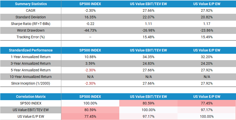
The results are hypothetical results and are NOT an indicator of future results and do NOT represent returns that any investor actually attained. Indexes are unmanaged and do not reflect management or trading fees, and one cannot invest directly in an index. Please see a list of descriptions and a list of disclosures here.
The takeaway from this side segment: Generally speaking, systematic value investing — buying cheap stocks on some price/fundamental value — has done poorly relative to other common strategies due to the headwind of the market (and growth stocks even more so) caring less and less about the fundamentals of a company and more about its future growth potential. Historically, the fundamentals of companies don’t matter until they do. And when they do, it has caused wonderful multi-year runs of outperformance for systematic value strategies. (We have a good post on the topic if you’d like to dig in further.)
Let’s take a look at some visuals from both markets (US and international stocks) that highlight some of the headwinds and tailwinds for systematic value investors. How cheap is value relative to the broader universe currently?
Headwinds
For those investing in international markets (value investing or otherwise) there’s been one large headwind over the last year and that’s dollar strength.
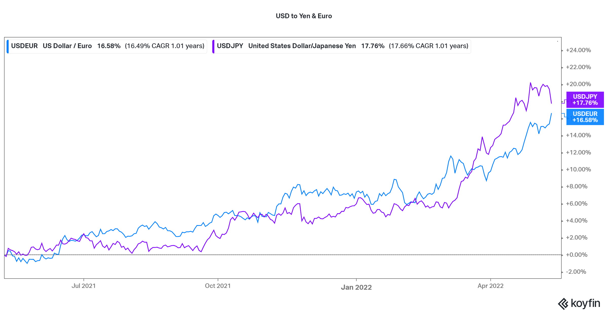
Over the last year, the Yen and Euro have had an almost 16%-17% decline against the dollar. For our international value and momentum strategies (and almost any international investing strategy), this is basically a 1-to-1 headwind. Over the long term, these are likely to equal out, but it makes for a longer race in the short run!
Now…let’s add in the 1-year return on the international developed stock ETF, EFA:
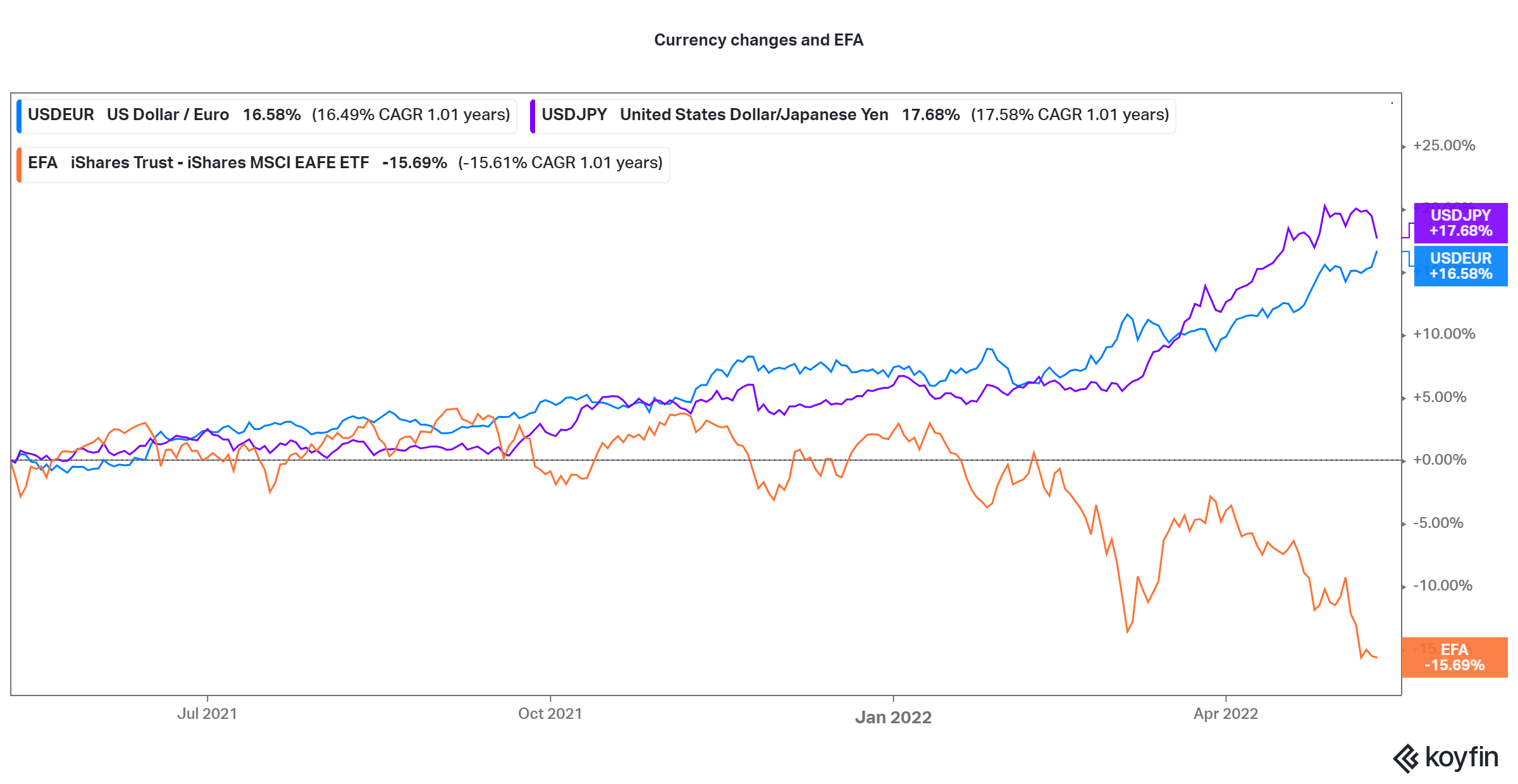
Down almost 16%! Looks like that currency headwind explains a lot of this “problem.” For the US stocks relative to international stocks, it’s obviously the inverse of this. So if you’re comparing your US stocks to international, you can look at these currency changes as a tailwind.
Tailwinds
Earnings/Price-based value portfolios
First, here’s Earnings/Price for value portfolios and broad passive portfolios (Higher up the line goes = cheaper value stocks are relative to growth stocks; lower = less cheap).
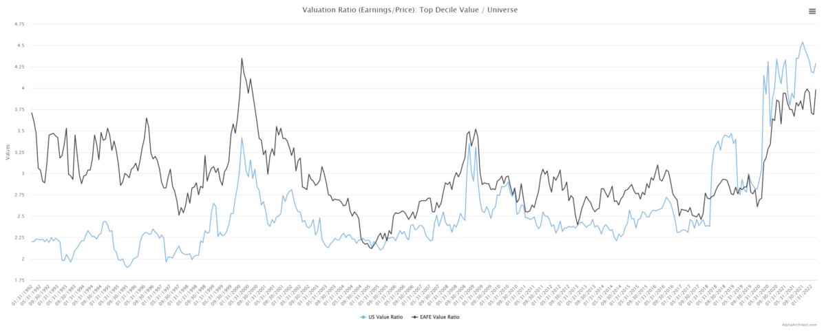
- The cheapness of US value stocks (blue line referred to as US value ratio) is right around it’s all-time high. And still higher than even the 1999/2000 Tech bubble. (2)
- The cheapness of Developed International value stocks (black line referred to as EAFE value ratio) is right around it’s all-time highs (just shy of the tech bubble).(3)
Book/Market-based value portfolios
Now the same charts for book/price:
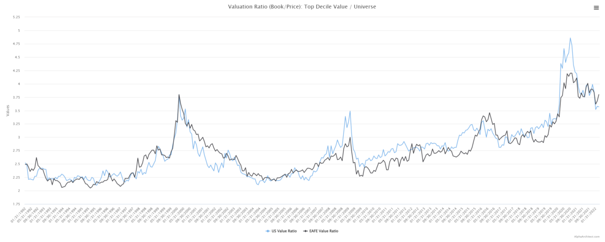
- Regardless of the valuation metric or the market geography — value stocks are historically cheap relative to the market. Here, international stocks have a slight relative edge over US value stocks against their respective universes.
Widening valuations a springboard?
On one hand, you could look at these valuations widening as a headwind. But we’re going to be optimists and look at them as tailwinds and make the *assumption* that at some point they will tighten as they did historically. And that would be a tailwind to these value stocks as it could mean the multiples on value stocks are increasing relative to growth stocks.(4) The point we are showing you, is that relative to history AND relative to the current universes (US stocks or international developed) value stocks are cheap. Great.
Which is Better? US or International Value?
An easy idea is “buy value stocks.” And we’ve had a few clients ask if it’s a better idea to buy US value stocks (which have done well) or international value stocks (which have struggled).
One can always buy US-based value stocks (not a bad idea), but what about international value stocks? Maybe there are value opportunities in international markets? Below is a chart of the past 10 years’ performance for a broad US market index and a broad developed international index.
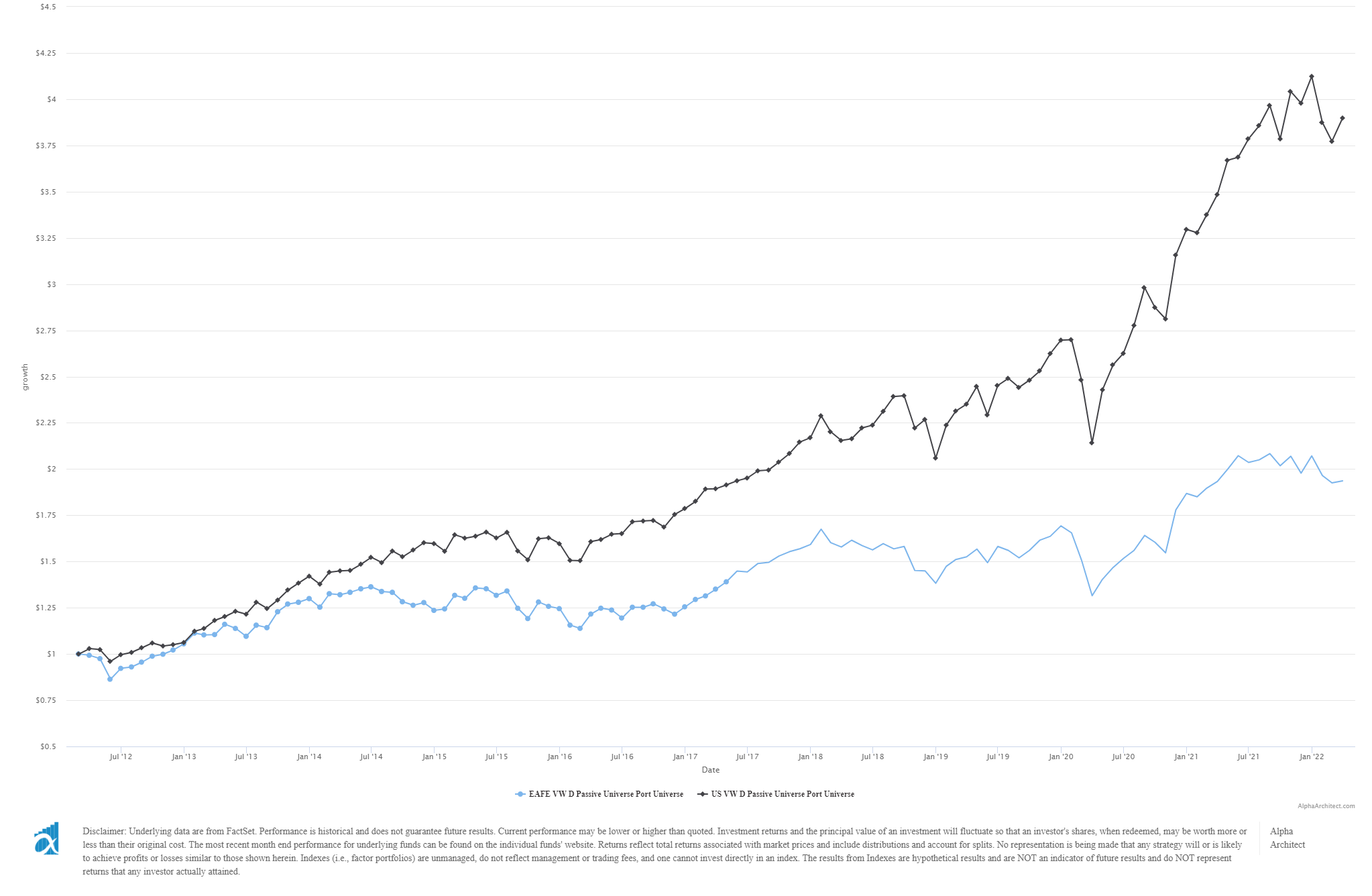
Yikes — the US has crushed international markets over the past 10 years. It’s safe to say that the US stock market has relative momentum over international stocks. The takeaway then on, “should I buy US or international value stocks?” is that it will largely depend on what the beta of those markets does. Remarkably, you can find similar value and quality in the US stock market as you can in the international stock market. If the beta of international stocks goes on a ripper, you might be better served in international vs. the US. If the opposite continues, then US value stocks are likely to continue their outperformance over their foreign counterparts. In short, in long-only strategies, it’s not just the value factor that matters, its also the beta of that respective market.
Here’s a comparison of our QV index (US value), IQV index (international value), and some benchmarks for them: MDY (S&P 400/Midcap) and EFA (International Developed ETF).
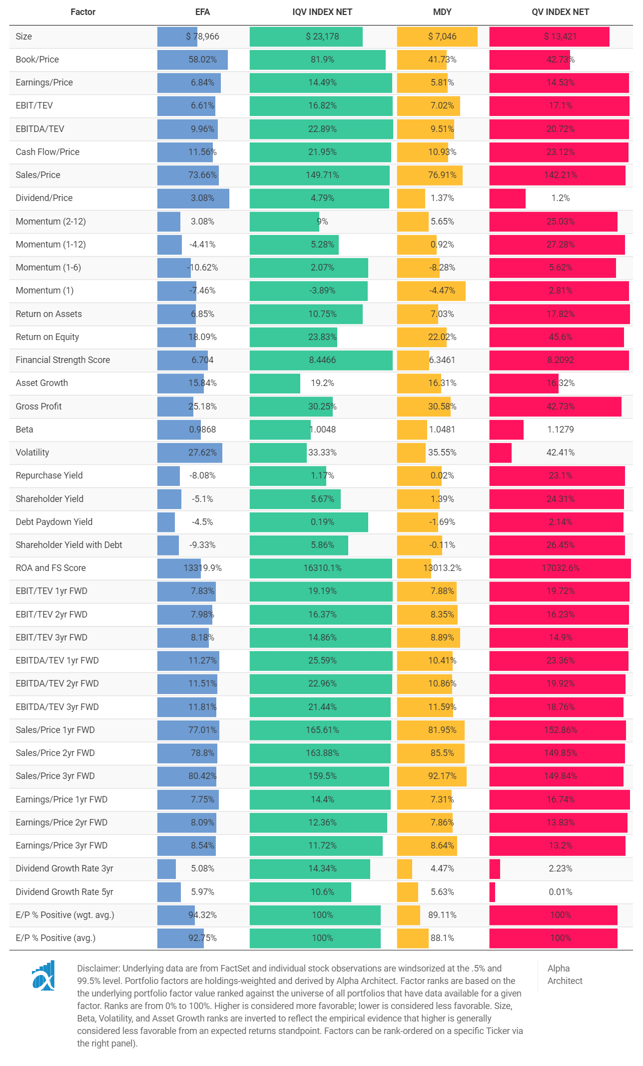
“Yowza. That’s a lot of comparing.” Let’s get right to the three metrics we feel are the varsity metrics: EBIT/TEV (value), 2-12 momentum, and Financial Strength Score (Quality).
QV (US Quantitative Value) and IQV (International Quantitative Value) are about tied on EBIT/TEV with around 17% yields (as are their benchmarks with around 7%). They’re about tied on financial strength at 8(5). The one big difference? The 2-12 momentum score is better for the QV index than any of the others, by a lot (25%).
Now, the QV index doesn’t target momentum (beyond our negative momentum screen), so this is just happenstance of US value stocks doing well compared to all the others we are looking at. US value stocks certainly have the relative strength over most equity assets out there.
Current Fundamentals on International Markets
Broad benchmarks
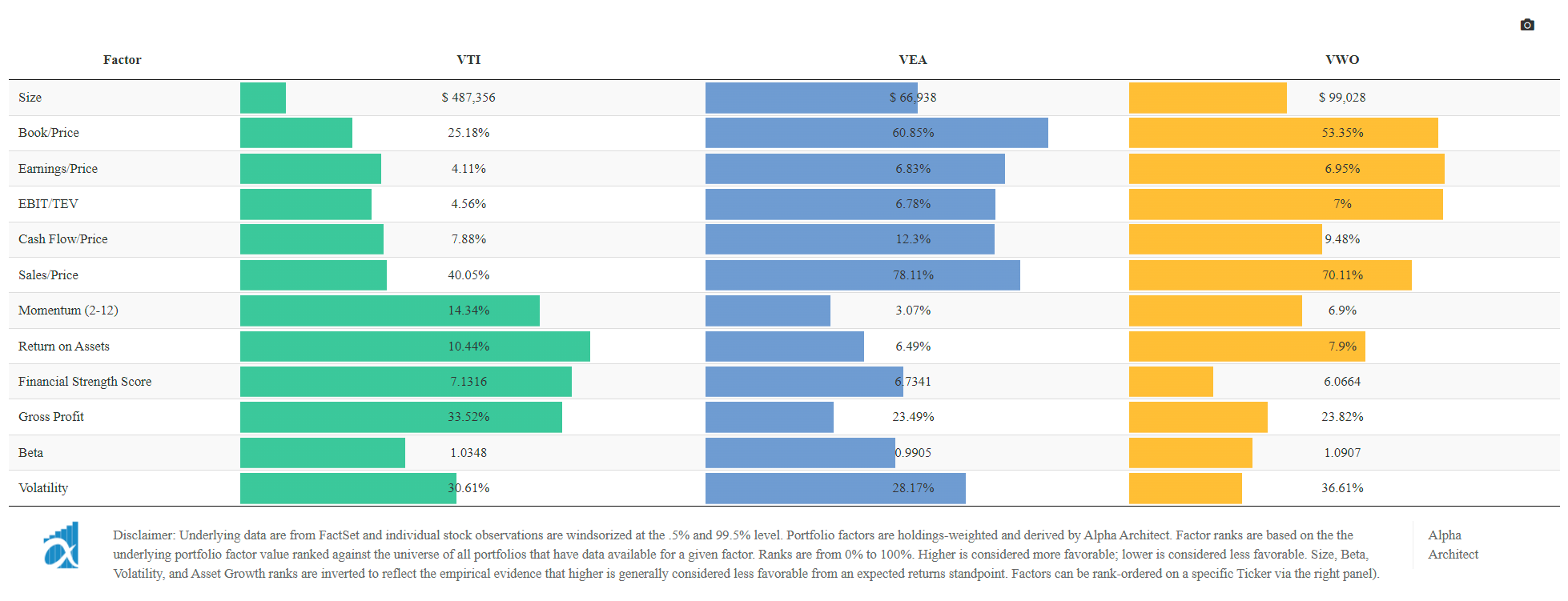
We first look at the holdings-weighted fundamental characteristics of some core benchmark-focused ETFs from Vanguard — VTI (US markets benchmark), VEA (Developed markets benchmark), and VWO (Emerging markets benchmark).(6)(7)
Few points:
- US is expensive (e.g., earnings yield, or e/p at 4.11%), but high quality (e.g., 10%+ ROA)
- Developed and emerging are cheaper (e.g., 6.5%+ earnings yield vs ~4%), but of lower quality (e.g., <8% return on assets vs 10%+)
- For the entire universe of stocks then, the US stock market, on the whole, is more “expensive” than it’s international counterparts.
What do international value strategies look like?
We add in several popular MSCI value strategies — EFV and IVLU — and our International Quantitative Value Index (more focused on cheap/quality and less on benchmark hugging). The results are below and highlighted in the red square.
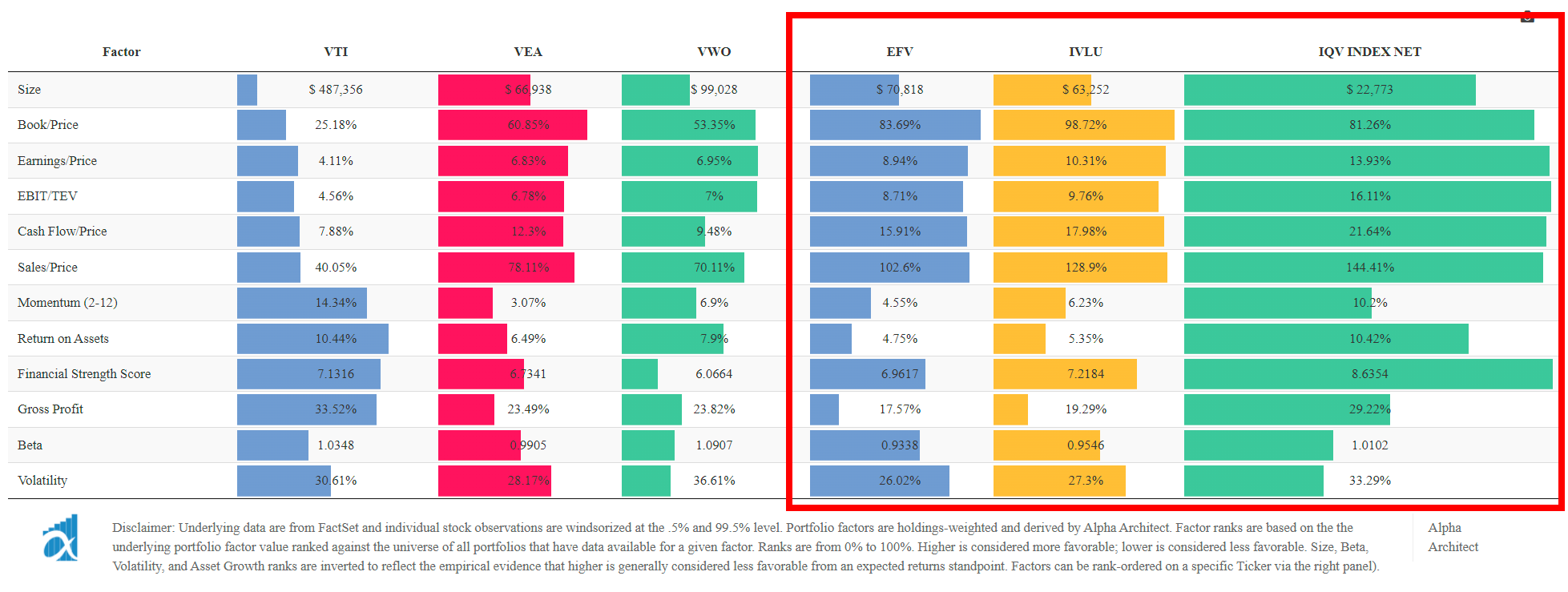
Few points:
- EFV is cheaper than the VEA benchmark, but the stocks are also junkier.
- IVLU is even cheaper than EFV, and the stocks are generally higher quality.
- IQV is the cheapest by far and the stocks are actually higher quality than the benchmark strategy (VEA). At a 16.11% EBIT yield, that means these companies have 16% of their total enterprise value they could in theory do whatever they wanted with. Raise dividends? Buybacks? Etc. Give it to us!
Conclusions on Value Investing
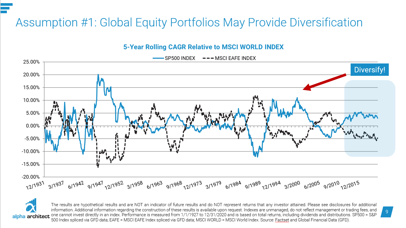
Are we at the peak of international underperformance relative to US stocks? It’s impossible to say. What we can say though is that historically markets have a rhythm to them.
On the US side, momentum and value stocks are on a solid run over the past 3 years (after a long run of struggling against the market). It feels like it happened overnight (though it obviously didn’t). When international markets turn, by the time you can “feel” it and see the performance over US markets, that means we’ll probably already be a couple of years into it. So…we are stuck with being back at the solution is to remain diversified (with international and US stocks). In the meantime, it’s good to know the characteristics are strong.
I’ll leave you with this chart from one of our presentations on “How To Use Alpha Architect Focused Factors.” You can see the rhythm. It’s extremely unlikely US stocks are going to outperform international forever. It’s a good time to hurry up and wait is about all we can say.
Appendix
How about international country indexes?
In the chart below we repeat the analysis above but compare MSCI EAFE countries to the benchmark international exposure represented by VEA.
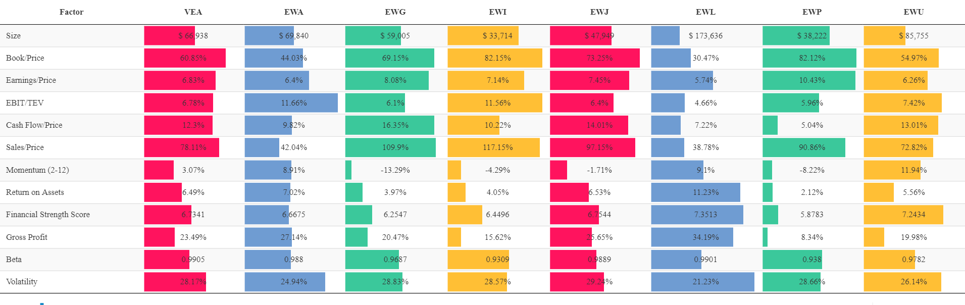
Few points:
- Japan, Germany, and Spain look the cheapest
- Switzerland takes the top spot on the ‘most expensive’ list
We can also equal weight all the underlying fundamentals into a “custom factor rank” and see how they stack up from best to worst.
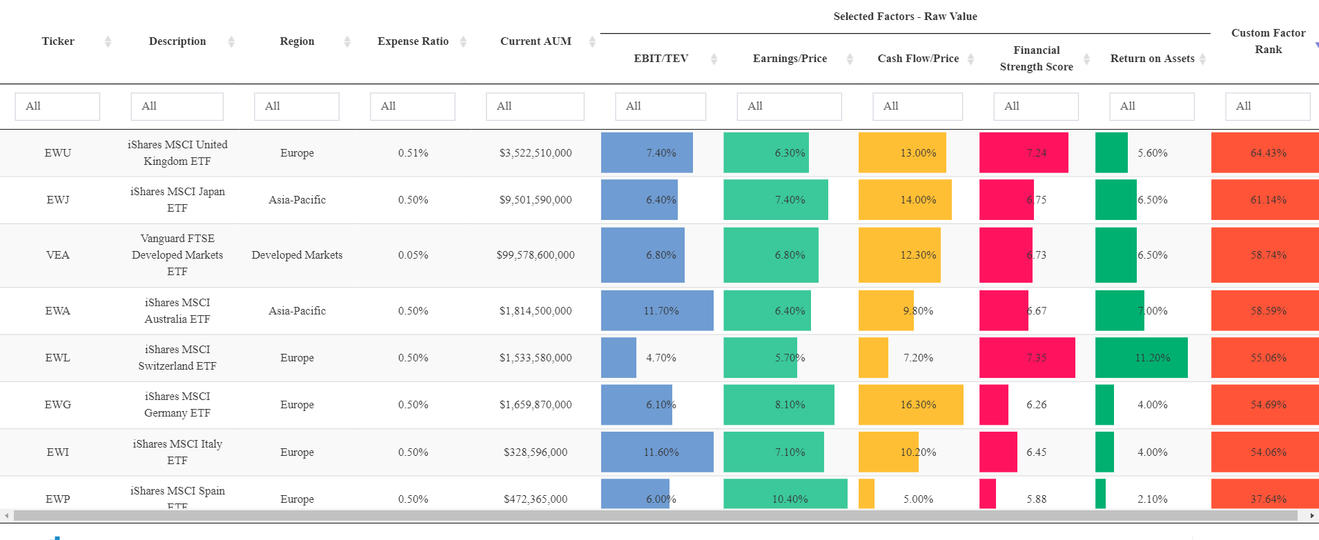
The United Kingdom and Japan look relatively good; the rest of the pack are actually worse than the broad index.
But this is from the perspective of a ‘country-level picker’. We can also look at how a country-agnostic deep value strategy stacks up against the various country-level indexes.
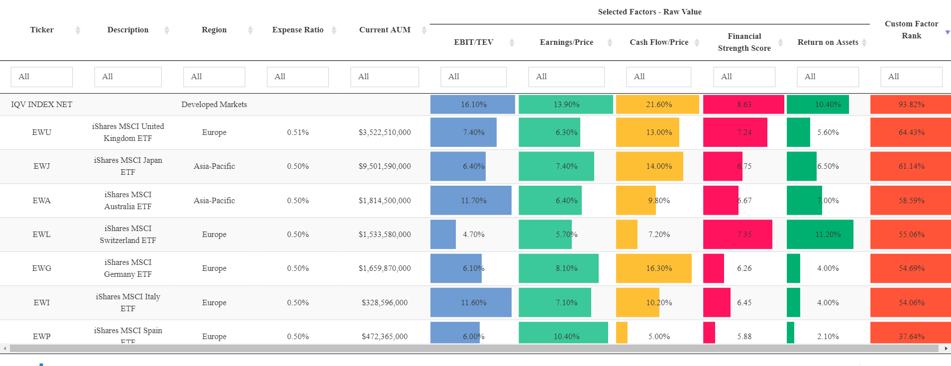
IQV, or International Quantitative Value, highlights that it is possible to find some really cheap and high-quality stocks in the international developed marketplace.
References[+]
| ↑1 | for the absolute performance of long-only investors, we certainly care about the general performance of the full stock market too, aka “beta” |
|---|---|
| ↑2 | What is the name of this current bubble? I haven’t heard a phrase for it. We had the tech bubble, then the financial crisis, and now we have the…work from home bubble? IDK, needs to be catchier. |
| ↑3 | To create these charts we first calculate the valuation of the 10% cheapest stocks on earnings/price and book/price. Next, we calculate the valuation of the broad universe of stocks. Finally, we divide the two figures to get a ratio of “value’s valuation” relative to the “market’s valuation”. A value of “1” would imply parity, anything above “1” means “value’s valuation” is higher than the market’s (which is what we would expect since we are looking at value stocks!). You can generate these charts with our Visual Value Factors tool. |
| ↑4 | Could also mean growth stocks multiples are decreasing relative to value stocks. But either way, it would be a relative tailwind |
| ↑5 | (just now its a score from 1-10, with 10 being the best a company can score) |
| ↑6 | Note these figures are from our portfolio architect tool, which is a client-only tool) |
| ↑7 | A quick note on the figures below…let’s take “size” for example. This figure represents the holdings-weighted market cap figure for the respective portfolios — so VTI has a holdings-weighted avg size of 487B+, whereas VEA is around 67B. |
About the Author: Ryan Kirlin
—
Important Disclosures
For informational and educational purposes only and should not be construed as specific investment, accounting, legal, or tax advice. Certain information is deemed to be reliable, but its accuracy and completeness cannot be guaranteed. Third party information may become outdated or otherwise superseded without notice. Neither the Securities and Exchange Commission (SEC) nor any other federal or state agency has approved, determined the accuracy, or confirmed the adequacy of this article.
The views and opinions expressed herein are those of the author and do not necessarily reflect the views of Alpha Architect, its affiliates or its employees. Our full disclosures are available here. Definitions of common statistics used in our analysis are available here (towards the bottom).
Join thousands of other readers and subscribe to our blog.