We’ve talked extensively about the concepts of active share and active fee, which aren’t flawless metrics, but they have elevated the discussion around identifying and understand the closet indexing phenomenon. To be clear, closet indexing is not necessarily a bad thing, it is simply a portfolio characteristic that should be transparently understood by investors so they can make a well-informed decision. Also, if you’d like to understand why asset managers closet index, I highly encourage you to read Pat O’Shaughnessy’s piece here and our piece on sustainable active investing.
Institutional investors are already aware of these concepts and have been for a long time. However, many individual investors, and those focused on serving the retail public (i.e., advisors), have arguably been duped by fund management companies over the year. These “retail” investors often thought they were buying a differentiated product, when in fact they were buying a closet index fund and paying a lot for that privilege.
Unfortunately, with the explosion of factor investing, and so-called “smart beta,” hitting the mainstream scene, helping investors understand what they are buying has become even more important. As we have discussed in the past, when it comes to factor investing, portfolio construction is extremely important in determining expected outcomes. See our write-ups on value and momentum, for example. Here is also a good piece on real value investing versus “closet-index” value investing. Chris Meredith has an excellent piece here as well.
Using Visual Active Share to Spot the Closet Indexer
To help investors better understand what they are buying when they purchase a particular investment fund, we did away with the math and numbers and created a picture. Here is a link to the tool. (Note. As of 4/7/2017, for some users the ETF selection box is not showing up. This is a known bug and we are fixing it ASAP.)
As they say, a picture is worth 1,000 words.
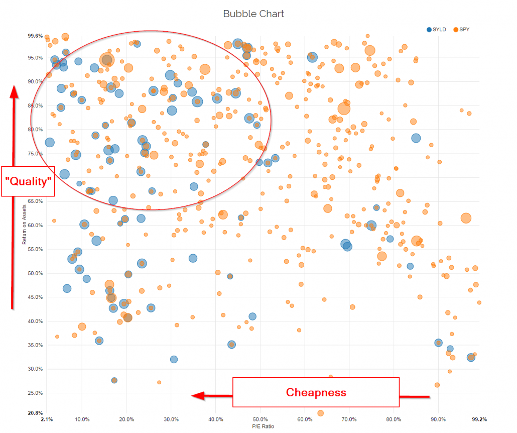
Here is an example of the technology in practice. We examine the current holdings of SYLD, a relatively focused ETF (~100 holdings) that sort securities primarily on shareholder yield (essentially a “value” proxy), and compare this to SPY, which represents the S&P 500 Index.(1)
We sort the holdings on 2 dimensions: P/E percentile (relative to the universe) and ROA percentile (relative to the universe). These characteristics are meant to capture the most basic “value” and “quality” metrics we could identify.
Naturally, a “value” fund should hold positions that have characteristics of cheapness (primarily) and quality (secondary consideration). The SPY should have no identifiable characteristic tilt because, by construction, this portfolio is holding a large swath of the total securities in the market.
One can see from the chart above that SYLD certainly looks and feels a lot more “valuey” than the SPY. SYLD is more expensive than SPY (59bps vs 9bps), but to the extent SYLD is capturing more of the value premium via their portfolio construction, and the value premium pays out a higher risk/mispricing premium over time, the expected return benefits may outweigh the marginal costs. The trade-off between fees and characteristic exposure is a discussion that can now be had, given the fact that visual active share helps investors transparently understand the make up of competing portfolios who claim the title of “value.”
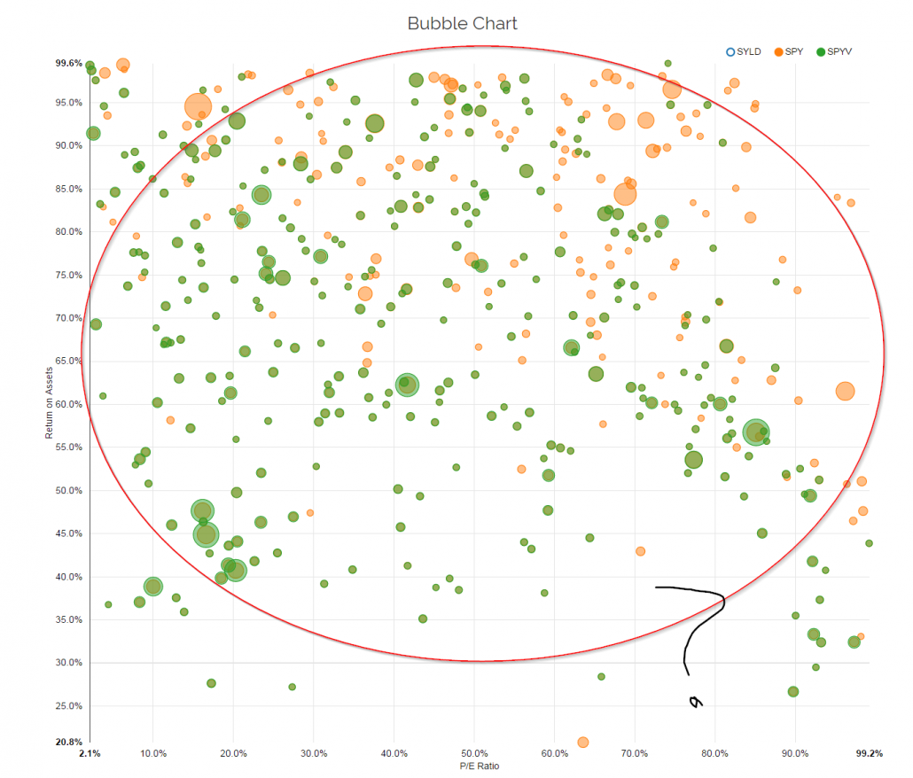
Let’s look at another example. We’ll compare another value fund — SPYV — to SPY. SPYV is also a “value” fund, just like SYLD, but when one examines the fund via the lens of visual active share, it becomes clear that SPYV is no more value than SPY — the index fund! If an investor is buying SPYV (or VOOV, VTV, IVE, SCHV, PRF, and so forth) in anticipation of capturing the so-called value factor premium over time, they will arguably fail. The value factor documented in academic research (see the top decile B/M portfolio on French’s website as an example) is not a closet-index fund. These portfolios that exhibit strong long performance are highly focused and concentrated on value stock characteristics — they don’t look anything like the generic market.(2)
The good news is SPYV is only charging 15bps vs 9bps for SPY. So the damage done via management fees is somewhat contained.
But what if SPYV was charging 59bps like SYLD? These are both value funds, so in theory, we can simply sort all value funds on expense ratios and buy the cheapest…SPYV at 15bps is a slam dunk in this regard. The problem is that an investor needs to understand 1) what they are paying and 2) what they are getting.
Warren Buffett has a classic quote on this form of decision-making:
Price is what you pay. Value is what you get.
We know what we are paying with these two funds: SYLD is 59bps and SPYV is 15bps.
But what are we getting with these two funds?
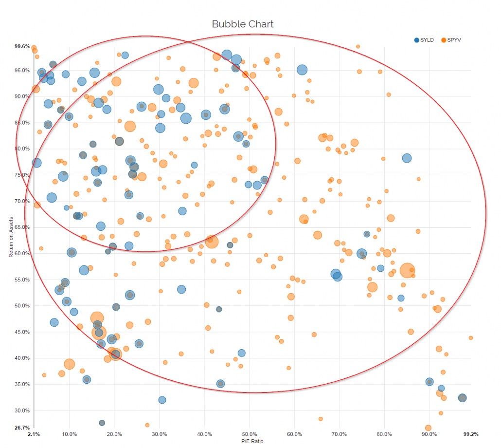
Here is the visual active share on SYLD and SPYV. Clearly, there is a large difference in exposure to generic value (P/E) and generic quality (ROA) (one can toy with other dimensions and find similar results). Does this increased concentration on the P/E & ROA characteristics outweigh the expected price differential between SYLD and SPYV? Depends on what an investor believes will be the factor premiums going forward. If one thinks these premiums will continue to be in the 3-5% range over long cycles, then there is a good case to buy SYLD because the increased exposure to the value/quality premiums will likely exceed the marginal costs. However, if the premiums are in the 50-100bps range, maybe SPYV is a better option? Or maybe we punt completely and go with SPY? That decision is a difficult one to make and tools like active fee can help (we’re building it), but acknowledging that this is a decision to be made has only come about because the visual active share tool is highlighting that these 2 value funds are not the same.
Closing Thoughts
Pure quantitative tools like active share and active fee can help quant geeks inform the costs/benefits decision when purchasing funds, but visual active share can help the rest of us “see” this very transparently.
Visual active share prevents funds from hiding behind PhDs, white papers, marketing fluff, and fancy mathematics to sell an overpriced S&P 500 index fund. The tool empowers investors to make better decisions.
If you’d like to dig in on the tool and help us with further development, we encourage you to visit our new tools website and give it a spin. We’ve got more ideas like this in development. Stay tuned.
Here is a video explaining some use cases and how the tool works:
Enjoy!
Note: Martijn Cremers also has a cool tool at https://activeshare.info/ for those who want to calculate active share and active fee, specifically.
References[+]
| ↑1 | Here is an article by Larry Swedroe that talks about a research paper we wrote on shareholder yield. Here is the source paper. |
|---|---|
| ↑2 | To be clear, the academic factors (such as Value) generally form the portfolios on the top 10%-20% on one characteristic (such as B/M for Value). So if one wanted to invest in the evidence shown in academic papers, there should be very few dots/circles (representing the companies) outside of the top 10%-20% on a value measure! |
About the Author: Wesley Gray, PhD
—
Important Disclosures
For informational and educational purposes only and should not be construed as specific investment, accounting, legal, or tax advice. Certain information is deemed to be reliable, but its accuracy and completeness cannot be guaranteed. Third party information may become outdated or otherwise superseded without notice. Neither the Securities and Exchange Commission (SEC) nor any other federal or state agency has approved, determined the accuracy, or confirmed the adequacy of this article.
The views and opinions expressed herein are those of the author and do not necessarily reflect the views of Alpha Architect, its affiliates or its employees. Our full disclosures are available here. Definitions of common statistics used in our analysis are available here (towards the bottom).
Join thousands of other readers and subscribe to our blog.


