Yield.
Within almost any asset class, investors want to know, what is the “yield” on the investment?
For some investors, this is the most important and only screen used when sorting funds. Mutual fund companies have found ways to feed the beast by “juicing” the dividend yield on equity funds. In addition, investors make behavioral errors when assessing stocks by treating the dividend yield and capital appreciation as separate items, as opposed to combining the two as “total return.”
So why would anyone expect, ex-ante, bond investors to be any different? Of course, who doesn’t want a higher yielding bond?
The paper we examine below shows that since bond investors tend to reach for yield, i.e. driving up prices and lowering the expected returns, it appears (on paper) that one can “reach for safety” and outperform. Here is a link to the paper, “Reach for Safety,” by Johnny Kang, Tom Parker, Scott Radell, and Ralph Smith (all from Blackrock).
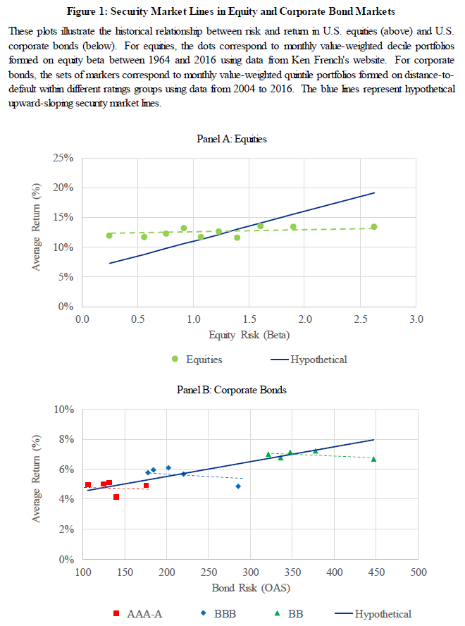
Figure 1, shown below, highlights the main idea of the paper. Within equity investing, it is well known that the security market line in U.S. stocks is flatter than what than what the CAPM model would suggest–meaning that higher beta stocks tend to have lower returns than one would expect according to the CAPM model. The paper then examines the same idea within the bond market, as is shown in Panel B.

The results are hypothetical results and are NOT an indicator of future results and do NOT represent returns that any investor actually attained. Indexes are unmanaged, do not reflect management or trading fees, and one cannot invest directly in an index. Additional information regarding the construction of these results is available upon request.
Unlike Panel A, which plots average returns against beta, Panel B plots the Average return to Bonds against the Bond Risk, as measured by the option-adjusted spread. Bonds with higher option-adjusted spreads (OAS), all else equal, should have higher expected returns as these are expected to be riskier investments. In Panel B, the data shows that within a specific bond investment class (AAA through A, BBB, and BB), as the OAS increases (i.e. higher yields), the average return realized actually decreases! Thus, if investors are reaching for yield, thereby pushing prices up and decreasing expected returns, one may be able to reach for safety to beat the benchmark (within each category).
Below we dig into the paper and the results.
Summary Analysis
To begin the paper, the authors highlight some of the literature that gives an insight or reason why investors may originally reach for yield.
From the paper:
For example, Becker and Ivashina (2013) report that insurance companies, some of the largest institutional holders of corporate bonds, exhibit an abnormal preference for higher yielding securities. Since insurance companies are subject to risk-based capital requirements, the authors use NAIC risk-based ratings categories to identify variation in reaching for yield behaviors. We draw inspiration from this methodology and also use ratings categories in defining our factors. Hanson and Stein (2015) show that commercial banks behave like yield-seeking investors with a particular bias towards longer term securities, especially when interest rates are lower. In other words, these investors tend to reach for yield and risk by extending the duration of their portfolio holdings. Choi and Kronlund (2017) find that corporate bond mutual funds also reach for yield, especially when bond yields are low and credit spreads are narrow.
Thus, it appears there is evidence in the literature that (some) investors tend to reach for yield.
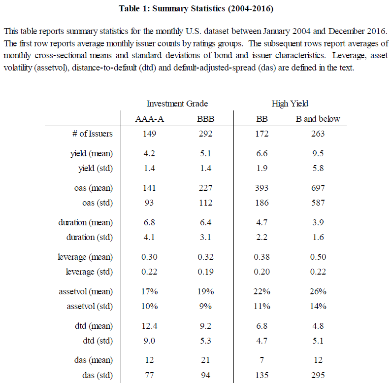
The paper then digs into the details on the sample of bonds they examine. Table 1, shown below, gives the summary statistics from 2004-2016 for the bonds examined in the paper. Both the Investment Grade and High-Yield categories as split into NAIC Categories.
- NAIC Category 1: AAA-A
- NAIC Category 2: BBB
- NAIC Category 3: BB
- NAIC Category 4 and below: B and below
This is done as (some) investors use this classification when making investment decisions, as well as pre-set guidelines (i.e. a manager can only have x% of NAIC category 3 or 4 bonds).
Below are the summary statistics from Table 1 of the paper:
The results are hypothetical results and are NOT an indicator of future results and do NOT represent returns that any investor actually attained. Indexes are unmanaged, do not reflect management or trading fees, and one cannot invest directly in an index. Additional information regarding the construction of these results is available upon request.
As is shown above, the average yield, OAS, leverage, and asset volatility increase as the credit quality decreases, while the duration decreases with credit quality. There are two additional variables in the summary statistics table, (1) dtd and (2) das, which warrant explanation.
In the paper, “DTD” is defined as the distance-to-default (DTD).(1) At a high-level, this measure uses inputs such as leverage, prior-year stock return, and asset volatility (to name a few), to generate a DTD value. A higher DTD value indicates a safer company. Not surprisingly, the DTD measure decreases with credit quality. The paper uses this measure within the analysis as the “quality” measure.
The table also has a measure, “DAS” which stands for default-adjusted-spread. Here is the definition from the paper:(2)
Within each ratings group, we run monthly cross-sectional regressions of the log of option-adjusted-spread against a constant and distance-to-default
The intercept controls for factors driving the general level of credit spreads, while the slope controls for the price of default risk across issuers. We estimate default-adjusted-spreads by taking the exponential of the residuals from this regression. A high (low) residual indicates a bond trading at a relatively low (high) price relative to its default risk, thereby indicating that it is cheap (expensive). While it is certainly possible to introduce additional variables in this regression or to consider alternative methodologies, we prefer this simple regression that yields a residual orthogonal to distance-to-default.
This measure is the “value” measure used within the paper. Table 1 highlights that while the mean is close to zero within each category (12, 21, 7, and 21 bps respectively), the deviation within each category increases with a decrease in credit quality (77, 94, 135, and 295 bps respectively).(3)
So how does one form portfolios given this information?
The paper standardizes each measure, by subtracting the cross-sectional mean and then dividing by the cross-sectional standard deviation–this is done using the mean and standard deviation within each NAIC category (as opposed to the overall average and standard deviation).
Portfolios are then formed by sorting bonds into quintiles based on the standardized quality and value scores.
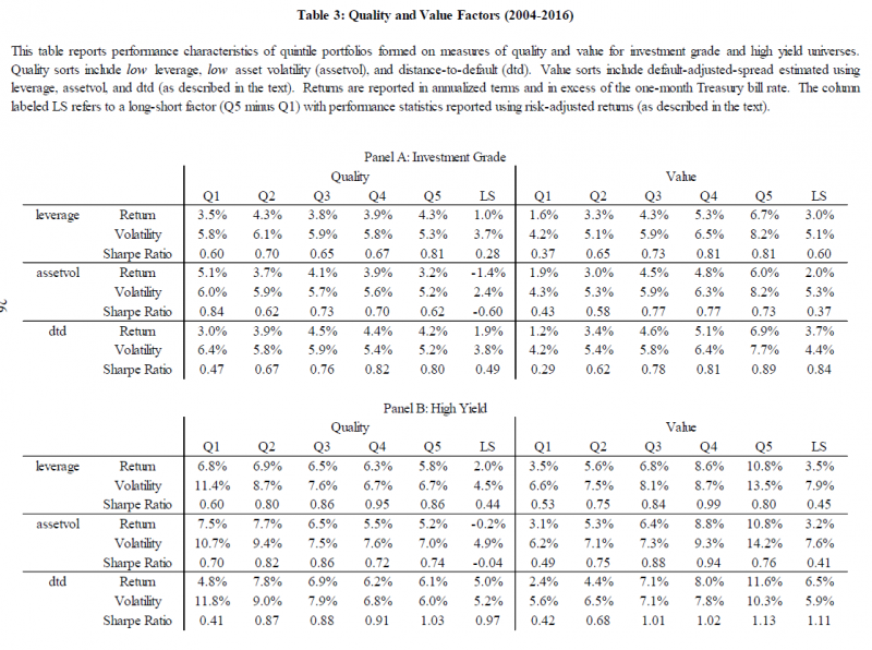
Table 3 shows the results to sorting portfolios on either (1) quality or (2) value for both Investment Grade (Panel A) and High-Yield (Panel B) bonds.
The results are shown below:

The results are hypothetical results and are NOT an indicator of future results and do NOT represent returns that any investor actually attained. Indexes are unmanaged, do not reflect management or trading fees, and one cannot invest directly in an index. Additional information regarding the construction of these results is available upon request.
The Quality measure quintiles are pretty straight-forward–the paper uses the standardized(4) (1) leverage, (2) asset volatility, or (3) DTD measures to sort bonds (within Investment Grade or High-Yield categories) into quintiles. Examining the quality results above, one sees that DTD has the strongest results when examining the quintiles, compared to the alternative measures: leverage and asset volatility. Thus, the paper recommends using DTD as the main quality score.
Turning our attention to the Value quintiles, a quick description is required to fully understand the table.(5) The paper uses a similar regression described in Equation 1 above but instead regresses the OAS against (1) leverage or (2) asset volatility. The paper then sorts firms into quintiles based on their standardized, exponential of the regression residuals, from regressions against (1) leverage, (2) asset volatility, or (3) DTD.
Examining the results, one finds that the DAS measure (standardized, exponential of the residuals generated from regressing OAS against DTD) has the most prevalent pattern of increasing Sharpe ratios from low to high. Thus, the paper recommends using DAS as the main value score.
Using Distance to Default and Default Adjusted Spread for Portfolio Decisions
Examining Table 3 again, we note that the bottom quintile generally has very poor (relative performance) using both the quality (DTD) and value (DAS) scores.
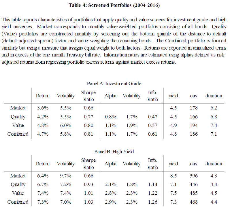
So the paper gives a simple proposal to form a portfolio–eliminate the bottom quintile! This simple bond portfolio excludes the bottom quintile on either (1) quality, (2) value, or (3) both measures. The remaining bonds are then value-weighted. The results to the portfolios are shown in Table 4 below:
The results are hypothetical results and are NOT an indicator of future results and do NOT represent returns that any investor actually attained. Indexes are unmanaged, do not reflect management or trading fees, and one cannot invest directly in an index. Additional information regarding the construction of these results is available upon request.
Examining the results above, one first notices that the portfolios had a higher return and Sharpe ratio by simply eliminating the bottom quintile firms on (1) Quality, (2) Value, and (3) the combination of the two measures. For the Investment grade portfolios, the combined portfolio had a slightly higher yield, OAS, and duration. However, for the high-yield portfolios, while having a higher return and Sharpe ratio compared to the market portfolio, the combined portfolio has a lower yield and OAS, with similar duration!
The paper finds even stronger results in an optimized portfolio (described in the paper, not shown here)–however, the big-picture takeaway is the following: by simply eliminating the bottom quintiles on quality and value, a bond investor would have generated higher returns and Sharpe ratios than the market bond portfolio, before transaction costs.
Conclusions
This paper highlights that within the bond market, it was possible in the past for an investor to “reach for safety” and generate higher returns than the market bond portfolio (at least on paper). Since investors have a preference for yield, they may push up the prices of higher-yielding securities which thereby reduces future returns. A simple screen proposes to eliminate the bottom quintile of bonds on either Quality, Value, or Both. By doing so, and purchasing the market-weighted portfolio of remaining bonds, the paper finds a higher return and Sharpe ratio compared to the market portfolio, before transaction costs. While transaction costs will eat into the outperformance, one should note that the simple portfolio is value-weighted, which generally reduces transaction costs.(6)
Thus, this appears to be a simple strategy(7) one can implement within the bond market, and is different than a bond strategy sorting on Value and Momentum.
Let us know what you think …
Reach for Safety
- Johnny Kang, Tom Parker, Scott Radell, and Ralph Smith
- A version of the paper can be found here.
- Want a summary of academic papers with alpha? Check out our Academic Research Recap Category.
Abstract:
In the corporate bond market, investor propensity to reach for yield creates an opportunity for factor-based investors to “reach for safety” following an economic intuition that parallels low-risk factor investing in equities. Given this insight, we motivate a measure of credit safety based on the Merton (1974) distance-to-default variable, which we use to define quality and value factors. We demonstrate that both factors help explain the cross-section of corporate bond returns in an uncorrelated and complementary manner. Since these factors have performed particularly well in their bottom quintiles, we demonstrate how they can be used as screens within long-only portfolios. In addition, we show how incorporating our quality and value insights in a long-only optimization setup can generate significant outperformance net of estimated transaction costs versus traditional value-weighted market portfolios.
References[+]
| ↑1 | Please read the paper for full details. This is based on the Merton 1974 paper. |
|---|---|
| ↑2 | I added “Equation 1”. |
| ↑3 | Table 2 of the paper examines the correlations of all the measures |
| ↑4 | Described above |
| ↑5 | I would recommend that the authors split this table into 2 tables, one for quality and another for value–in my opinion, the current layout can cause confusion for the reader. |
| ↑6 | It should be noted that the optimized portfolio shows outperformance even after accounting for turnover and transaction costs. |
| ↑7 | Assuming one has the data! |
About the Author: Jack Vogel, PhD
—
Important Disclosures
For informational and educational purposes only and should not be construed as specific investment, accounting, legal, or tax advice. Certain information is deemed to be reliable, but its accuracy and completeness cannot be guaranteed. Third party information may become outdated or otherwise superseded without notice. Neither the Securities and Exchange Commission (SEC) nor any other federal or state agency has approved, determined the accuracy, or confirmed the adequacy of this article.
The views and opinions expressed herein are those of the author and do not necessarily reflect the views of Alpha Architect, its affiliates or its employees. Our full disclosures are available here. Definitions of common statistics used in our analysis are available here (towards the bottom).
Join thousands of other readers and subscribe to our blog.


