Our firm Allocate Smartly provides independent analysis of Tactical Asset Allocation (TAA) strategies. TAA strategies dynamically allocate to broad asset classes like stock indices, bond indices or gold. Unlike a traditional buy & hold portfolio, TAA is able to increase allocation to assets expected to outperform and reduce allocation to those expected to underperform, to enhance returns.
Readers can also access a wealth of information about TAA right here in the Alpha Architect research archive. New to TAA? Here’s a great primer on the subject, and a smart interview with Corey Hoffstein of Think Newfound, to get you started. Meb Faber and Gary Antonacci have also written seminal books on the subject.
Allocate Smartly tracks more than 30 TAA strategies in near real-time, sourced from academic papers, books and other publications (click for the complete list). Members can combine those strategies into custom portfolios with the click of a button to diversify not only across asset classes, but also across different approaches to trading, ranging from momentum and trend-following (like Alpha Architect’s Robust Asset Allocation) to portfolio optimization techniques like Minimum Variance.
TAA has underperformed in the recent past relative to common benchmarks like the US 60/40 portfolio. Given the depth and breadth of strategies that we cover, we’re in a unique position to understand why. While we don’t (yet) track every published model, those that we do are broadly representative of the TAA space and allow us to draw some general conclusions about the state of TAA. Here’s the short version: TAA’s recent underperformance relative to 60/40 is a result of recent (likely unsustainable) strength in those specific assets. When compared to a more relevant benchmark, TAA has largely done what it’s designed to do, and continues to provide real value for the long-term investor.
Tactical Asset Allocation’s Recent Performance
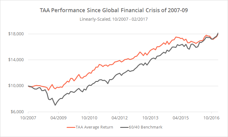
To illustrate TAA’s recent performance, the graph below shows the average return of all of the TAA strategies that we track (orange) versus the 60/40 benchmark (grey), net of transaction costs, since the onset of the Global Financial Crisis. Transaction costs are assumed to be 0.1% per trade (0.2% round-trip).
Most tactical asset allocation strategies are designed with the same basic goal: keep pace with the markets during the good times (like we find ourselves in right now), and shine during the bad times by minimizing losses.
It’s unsurprising then that TAA outperformed 60/40 through the worst of the crisis by roughly 25% (10/2007-02/2009). That’s TAA’s bread and butter though, so let’s set that aside.
Since the market bottom, TAA has trailed the 60/40 benchmark by 4.3% annually. That’s a big — and important — difference! But digging a little deeper, it’s not difficult to explain why that difference is so large. The 60/40 benchmark (a blend of 60% US equities and 40% US Treasuries) makes for a convenient reference point, but it doesn’t accurately represent the opportunity set available to asset allocation models. It ignores key asset classes, including non-US assets and significant diversifying assets like commodities and precious metals.
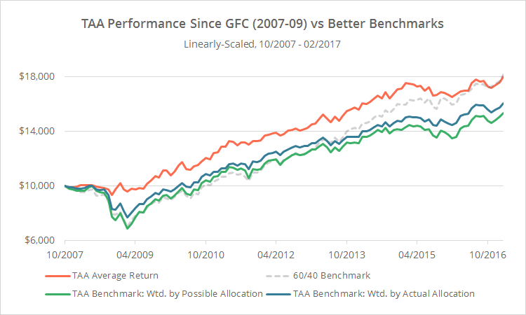
In the graph below, I’ve added two additional benchmarks to our graph. The first (green) represents all of the global assets available to our 30+ TAA models, weighted by the number of models that employ that asset. In other words, this benchmark represents the assets that TAA could choose. The second (blue) represents those same assets, weighted by TAA’s average allocation to those assets from the start of the GFC to the present. In other words, this benchmark represents the assets that TAA did choose.
Put another way, the difference between the green line and 60/40 represents the impact of the specific universe of assets that TAA has available to it. The difference between the blue line and the green represents the impact of TAA’s average allocation to that universe. And the difference between the orange line and the blue represents the impact of TAA’s market timing.
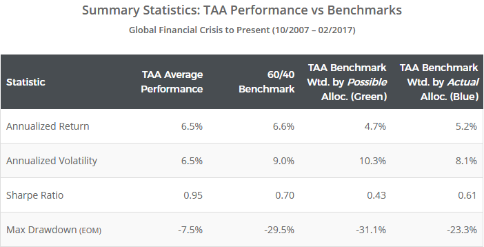
Here are some basic summary statistics for the equity curves shown above:
Since the market bottom, TAA has kept pace with these more complete benchmarks. Further, given the assets available to it (i.e. the green line), TAA made good decisions in terms of the way in which it weighted those assets (the blue line).
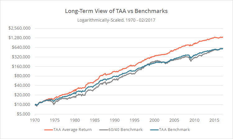
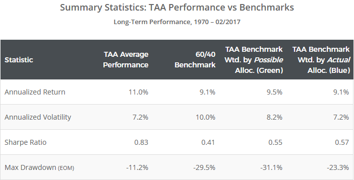
It would be easy to conclude from these results that the 60/40 benchmark is somehow superior to the broader asset universe, but that would be potentially misleading. 60/40’s outperformance since the GFC arguably benefits from 20/20 hindsight, and may or may not hold out of sample. Below I’ve expanded our graph to 1970, net of the same transaction cost assumptions described previously. For simplicity, I’ve only shown our “blue” TAA benchmark vs 60/40.
This longer-term view shows that, while 60/40 outperformed the TAA benchmarks during two extended periods (the late 1990’s and right now), overall, both have generated similar returns. The broader TAA benchmarks have been superior in terms of Sharpe Ratio (and other measures of risk-adjusted performance) due to a more diversified asset mix. If the late 1990’s are any guide, the recent outperformance of the 60/40 benchmark may correct itself in due course.
And here are the summary statistics for the equity curves above:
In short, TAA has done a respectable job both during and after the Global Financial Crisis. It sidestepped the worst of the market losses, made good decisions given the assets available to it, and kept pace with the recovery when compared to a more representative benchmark. That’s in line with the aforementioned goal of TAA: keep pace in the good times and outperform in the bad times. Recent underperformance relative to the narrower US 60/40 benchmark is largely a result of the recent strength in US equities and Treasuries. TAA systems, which are globally diversified across a wider variety of asset classes, have an arguably better risk management policy in place. The US 60/40 could continue to beat all globally diversified platforms in the future, but investors seeking to participate in global risk premiums may be caught flat-footed if there is some event in the future that is specific to the US markets (and long term history suggests this is possible).(1)
Playing Devil’s Advocate
Although we’re in the business of bringing transparency to tactical asset allocation, I want to ensure we are fair and balanced in our assessment of these programs. TAA’s long-term track record is solid, but like all active strategies, these models can have their share of short-term missteps.
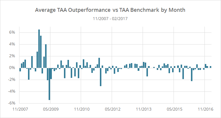
To illustrate, the chart below shows the average monthly outperformance of all of the strategies that we track, versus our more representative (blue) TAA benchmark, from the start of the Global Financial Crisis. Positive numbers indicate that TAA outperformed the benchmark, and negative numbers indicate that TAA underperformed. Ignore for a moment the significant outperformance during the GFC, as that’s TAA’s bread and butter.
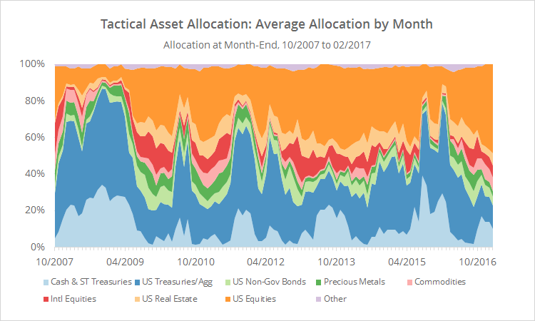
Now, align that chart with the one below showing the average asset allocation of all of the TAA strategies that we track, as of the end of each month. To make the chart easier on the eyes, assets have been grouped into broad categories, so for example, “US Equities” might include anything from the S&P 500 to individual stock market sectors. Generally speaking, more defensive assets (ex. cash and US Treasuries) are towards the bottom of the chart, and riskier assets (ex. equities and real estate) are towards the top.
Note the multiple instances since the Global Financial Crisis ended where TAA ramped up exposure to defensive assets like cash and Treasuries in response to perceived market weakness. We know in hindsight that, given the strength and consistency of this bull market, those were likely bad decisions, and that’s borne out in the monthly numbers. Most months when TAA suffered any significant degree of underperformance were instances when TAA was positioned too defensively, only to have riskier assets rebound. TAA’s cautiousness works in the long run by sidestepping major losses, but sometimes works against it in the short run.
While these missteps are not insignificant, the results presented in this post show that they’re much less significant than the 60/40 benchmark would make them out to be. Taken as a whole, TAA has done it’s job both during and after the Global Financial Crises. It mitigated the worst of the market losses, made reasonable decisions given the assets available to it, and largely kept pace with the recovery when compared to a more representative benchmark. And that’s essentially what TAA is designed to do: keep pace in the good times and outperform in the bad times. Recent underperformance relative to the narrower 60/40 benchmark is largely a result of the recent strength in those specific asset classes, likely an anomaly, and likely to correct itself in due course.
References[+]
| ↑1 | A geek note: We opted to compare TAA to this benchmark derived from TAA model universes in order to showcase the unique data available at Allocate Smartly. Another effective approach would have been to compare TAA to some other globally diversified universe, like the Global Market Portfolio. Had we done so, the conclusion would have been the same: 60/40’s recent outperformance is anomalous and a poor choice for a TAA benchmark. |
|---|
About the Author: Walter Jones
—
Important Disclosures
For informational and educational purposes only and should not be construed as specific investment, accounting, legal, or tax advice. Certain information is deemed to be reliable, but its accuracy and completeness cannot be guaranteed. Third party information may become outdated or otherwise superseded without notice. Neither the Securities and Exchange Commission (SEC) nor any other federal or state agency has approved, determined the accuracy, or confirmed the adequacy of this article.
The views and opinions expressed herein are those of the author and do not necessarily reflect the views of Alpha Architect, its affiliates or its employees. Our full disclosures are available here. Definitions of common statistics used in our analysis are available here (towards the bottom).
Join thousands of other readers and subscribe to our blog.


